October 11, 2026
American Walnut Home Decor Ideas for Warm, Modern Homes
Updated on: 2026-10-11
American walnut home decor brings warmth, visual depth, and long-lasting style to modern and classic interiors. Its medium-to-dark tones pair well with natural fibers, matte metals, and stone textures. The key to a cohesive look is selecting the right finishes, balancing walnut with lighter elements, and avoiding overcrowded styling. This guide explains practical mistakes, offers pros and cons, and outlines a simple, repeatable approach to decorating with walnut.
American walnut home decor is a reliable way to upgrade a room without making design decisions that age quickly. Walnut is known for its rich brown color, fine grain, and steady visual character. When used thoughtfully, walnut elevates everyday spaces such as living rooms, dining areas, entryways, and home offices. This article teaches you how to choose walnut pieces that feel intentional, how to combine them with complementary textures, and how to avoid styling errors that can make even beautiful wood look flat.
Walnut’s appeal is not only aesthetic. It also fits many design directions, including transitional, Scandinavian-inspired interiors, and contemporary homes that favor warm materials. Rather than relying on trend-based decoration, walnut creates an anchor element that supports the rest of your palette. The result is an environment that feels both curated and livable.
Common Mistakes to Avoid
When people struggle with walnut-inspired interiors, it is usually because the finish and styling are not aligned. Below are the most frequent issues to watch for.
Choosing mismatched undertones: Walnut can lean toward golden brown, chocolate brown, or cooler brown. If other wood tones are significantly warmer or cooler, the room can feel disjointed.
Using walnut as the only color driver: If most surfaces are dark, the space can look heavier than intended. The fix is to add lighter wall paint, textiles, or decor to create contrast.
Overloading with competing patterns: Walnut grain is naturally distinctive. If you combine it with busy upholstery prints, loud rugs, and multiple ornamental accents, the visual focus becomes diluted.
Ignoring scale: Large walnut elements can dominate a small room, while tiny pieces can look lost in a larger layout. Match the size of your decor to the proportions of the space.
Assuming all finishes behave the same: Matte finishes hide fingerprints and reduce glare, while higher sheen can emphasize dust and surface imperfections. Select the finish that fits your lifestyle.

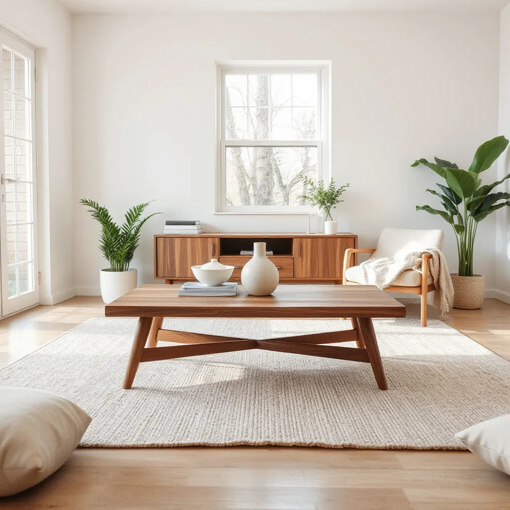
Warm walnut tones balanced with light textiles
Pros & Cons Analysis
American walnut home decor has clear strengths. It also has a few limitations you should consider before committing to a theme across multiple rooms.
Pros
Elegant, naturally rich appearance with visible grain character.
Strong compatibility with neutral palettes, including cream, beige, and soft gray.
Works across decor styles, from classic to contemporary.
Pairs well with materials that reflect light subtly, such as brushed metal and stone surfaces.
Creates a lasting design foundation that is less dependent on seasonal trends.
Cons
Dark tones can reduce perceived brightness if you do not add contrast.
Pronounced grain means styling must be intentional to avoid visual clutter.
Some finishes may require extra care to maintain an even look over time.
If paired with the wrong wood tone, the room may feel less cohesive.
To make the best use of walnut, treat it as a “core material.” Once the core tone is set, you can confidently add color through textiles, artwork, and greenery. This approach keeps the room balanced and prevents the decor from feeling accidental.
Quick Tips
The goal is to create a coherent look that feels warm and purposeful. Use the following strategies as a checklist while selecting pieces and planning placement.
Start with a dominant walnut element, then add two supporting materials. For example, combine walnut with linen and matte black hardware, or walnut with wool and warm beige ceramics.
Use the “three-tone rule.” Choose one dominant dark tone, one mid tone, and one light tone. This keeps American walnut decor from overwhelming the room.
Add texture to complement grain. Include woven baskets, textured throws, or softly brushed fabrics. Texture supports walnut’s organic feel.
Balance glare and sheen. If you have glossy surfaces, opt for walnut items with a matte finish. If your room is already matte, a satin finish can add gentle dimension.
Layer rugs carefully. A rug can unify walnut furniture by adding color, pattern restraint, and visual grounding.
Keep accessories in a controlled range. Choose decor items with consistent finishes such as brushed steel, aged brass, or dark bronze.
If you want a more coordinated walnut look quickly, focus on one area first. The living room often offers the best “before and after” impact because it has multiple visual touchpoints. Consider anchoring the room with walnut-inspired styling, then extend the palette to the entryway or home office.

Balanced interior layout with layered textures
To help you see how walnut can work with complementary design elements, consider a targeted purchase that supports the overall tone. For example, a walnut-centric centerpiece can establish warmth immediately, while carefully selected textiles and layout decisions keep the design polished. If you are building a cohesive room, you may also explore walnut-adjacent decor options available on snagva.com, such as an American walnut-focused limited edition piece at American walnut limited edition. This can serve as a tonal anchor while you refine the rest of the room through color and texture.
For floor grounding, a rug can strengthen the room’s harmony with walnut. A vintage-inspired rug can add warmth and pattern interest without competing with wood grain. If you want to create a layered, grounded look, browse rug options on snagva.com such as vintage Turkish kilim runner or vintage Turkish kilim accent rug. Choose tones that echo walnut browns and keep the pattern scale proportional to the furniture.
Textiles also influence how walnut appears. Curtains, cushions, and throws can either brighten the palette or make the space feel dense. When styling around walnut, lean toward natural fibers such as cotton, linen, and wool. These materials create a refined contrast against smooth wood surfaces and reinforce a warm, inviting atmosphere.
Finally, maintain visual clarity. Leave breathing room around walnut pieces, especially near windows and entryways. This helps the wood tones stand out naturally and prevents the room from looking crowded.
Wrap-Up & Key Insights
American walnut home decor succeeds when walnut is treated as a design foundation rather than a single decorative item. Select pieces with compatible undertones, balance dark tones with lighter elements, and keep patterns and accessories within a reasonable range. When you add texture through textiles and choose finishes that match the room’s lighting, walnut becomes a consistent source of warmth and sophistication.
If you want to refine your space, start with one area, apply the three-tone balance, and then extend the palette gradually. For a cohesive result, choose one walnut anchor and let rugs and textiles support it. Take action by selecting the next element that improves contrast and texture, and build from there.
Q&A Section
How can I make American walnut home decor look bright instead of heavy?
Use contrast intentionally. Pair walnut with light walls, off-white textiles, and softer neutrals such as warm beige or creamy gray. In addition, choose matte finishes to reduce glare and place bright light sources where the room needs visual lift, such as near reading areas or entry points.
What colors blend best with walnut wood tones?
Walnut commonly harmonizes with cream, beige, taupe, and soft gray. It also works well with muted greens, terracotta accents, and deep navy used sparingly. To keep the look cohesive, repeat one or two accent colors in more than one material type, such as cushions and artwork.
Does walnut pair well with modern furniture and metal finishes?
Yes. Walnut tones are especially effective with contemporary metal finishes like brushed black, dark bronze, and satin stainless steel. To maintain balance, keep metal accents consistent and avoid mixing too many different hardware colors in the same room. Textiles can soften the contrast between wood grain and metal geometry.
How do I prevent walnut decor from looking mismatched across rooms?
Create a consistent palette and undertone strategy. Select pieces that share a similar brown direction, then repeat key textures such as linen, wool, or woven baskets. When moving to another room, keep at least one color and one material consistent so the overall home feels connected.
About the Author
Snagva
Snagva is a home and lifestyle platform with expertise in curated interiors and material-driven design decisions. The team focuses on helping readers build cohesive spaces through practical styling guidance and smart pairing strategies. We value clarity, balance, and durable aesthetics. Thank you for reading and for choosing a design direction grounded in quality.
Disclaimer: This article is for general informational purposes only and does not constitute professional design or purchasing advice. Always verify product details, finishes, and care instructions with the specific item you intend to buy.
The content in this blog post is intended for general information purposes only. It should not be considered as professional, medical, or legal advice. For specific guidance related to your situation, please consult a qualified professional. The store does not assume responsibility for any decisions made based on this information.